|
|
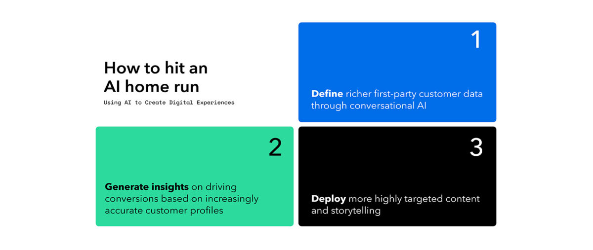
GXM is SJR’s proprietary content experience manager, designed to offer a new way to diagnose, optimize, and scale content that actually works. Last time, we looked at content gaps and stale assets. Today, we’re talking about something equally pressing: how to prove what content is driving conversion and stop wasting energy on what’s not.
Your content is working. Or it’s not. Either way, shouldn’t you know?
Every web and content team gets asked—and few can answer—the question: What content is actually driving performance?
Attribution has long been a black box in the world of B2B content. You know content matters. But which pieces? How much? And why?
The attribution model behind SJR’s content intelligence system opens the box—and shows you exactly where to double down.
Turning Insights into an AI Content Strategy
Most attribution tools are either too simplistic (last-click models that ignore the full journey) or too convoluted to act on. We’re taking a different approach when it comes to data.
We run a regression-based model that quantifies the influence of both content categories on your website as well as observed behavior to determine their relationship with conversion events — real signals, not assumptions.
Without revealing too much of our special recipe, our model is powered in part by how we continuously experiment. The platform introduces natural variation into content exposure, subtly shifting what users see and when. By analyzing the effect of those differences on user behavior over time, we can reliably estimate how each type of content impacts conversion.
It’s important to note that we measure the relative effect of content based on how conversion is defined. If “conversion” means signing up for a newsletter, certain content categories may correlate positively, while others may suppress action. But if “conversion” means making a purchase, those dynamics may shift. Critically, clients can define multiple conversion events. This flexibility allows clients to tune the model to what matters most for their business goals.
How One Client Proved Content’s Value
The visual below shows a real (anonymized) example from a client engagement. Each bar represents the relative influence, positive or negative of a given content category or behavior on conversion. What you’ll notice immediately is that not all content is created equal.
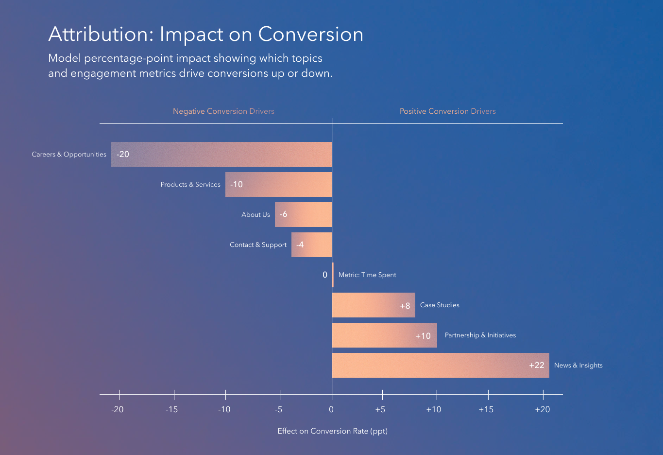
This client, chose to use its site’s navigation bar categories as the taxonomy for attribution. Why? Because its nav reflected the strategic content pillars the marketing team was already reporting against. It was the most familiar and politically practical lens to start with.
It also helped teams quickly understand and act on the insights: Internal teams could immediately recognize where specific content lived and how each area was (or wasn’t) contributing to performance. For large organizations, aligning attribution with something as visible and familiar as the nav menu can be a smart first step — it creates instant relevance, and more buy-in for acting on the results.
What did the data tell them?
- Top Performers: Content categories like News & Insights, Partnerships & Initiatives, and Case Studies consistently show a positive correlation with conversion. They signal credibility, momentum, and proof — what B2B decision-makers crave when they’re getting serious. These are the assets pulling their weight.
- Underperformers: On the flip side, you might think Products & Services content would be a driver of conversion, but for this client, it is conversion repellent. This may point to issues in how the Products & Services content is structured or messaged. This content may be necessary for other reasons, but if performance is the goal, it needs a rethink.
- The Surprise? Even Time Spent, a vanity metric in most dashboards, shows up with near-zero impact here — proving once that attention doesn’t always equal intention.
The intelligence we gathered also showed our client exactly what to do next:
- Build more of what converts: News, partnerships, and case studies.
- Refocus the rest: It’s not about deleting, it’s about refocusing the negatively correlated content to drive performance.
- Evolve the taxonomy: A smart next step would be segmenting “Products & Services” content to understand if specific sub-categories are particularly repellent.
How AI-Powered Content Audits Identify High-Impact Assets
Over time, these kinds of insights open the door to new ways of organizing and measuring content. Our attribution model is incredibly bespoke, so while navigation categories made for an intuitive starting point for this client, the next step might be to reframe those groupings.
Take a MedTech company, for example — one that structures its content around key audience groups like surgeons, procurement teams, and hospital admins. We can map attribution to those exact content tracks, making it easy to see what is (and isn’t) working for each audience, on their terms.
Similarly, imagine breaking out the Case Studies category in the graph above into five sub-categories, each mapped to a different decision-maker or use case. This can help unlock sharper insights and enable even more precise optimizations.
That level of granularity is entirely possible with our model. Because it is fully adaptable, clients can evolve their taxonomy as their strategy matures, moving from what’s easy to track to what’s most valuable to understand.
Why Content Intelligence Matters?
Neither your team’s time or your budget are infinite. If you’re investing equally across all content categories—or chasing engagement in areas that don’t convert — you’re diluting your strategy.
The beauty of SJR’s attribution model is that it doesn’t just explain what happened, it clearly indicates what should be done next and where you should place your resources.
It turns content into a measurable growth lever, not just a branding exercise. So when your CFO asks you how content can drive more revenue, you’ll have the answer.
See how GX Manager uses Content Intelligence to deliver 1:1 personalization, real-time answers, and dynamic pages that drive action.