5 Min Read | Creative

Can AI make designers better, or does it make them want to chop their arms off?

‘Ant-Man,’ AI, and humans: A design experiment

Step into the world of Midjourney, the AI image generator, and you are immediately struck by its sign-up screen—the mutating mash of letters and numbers seems ripped out of the Matrix mainframe.

Get behind its walls and you enter an ever-expanding world of Discord community feeds, many of which require permission to access. Within these threads, throngs of users endlessly prompt Midjourney to pop out images using a language some call “prompt engineering.”

Play with the tool for long enough and you find each prompt is its own missive to the AI, always beginning with a mandatory, slightly ironic directive: “/imagine”—as if it truly can. Yet, to the independent research lab behind this revolutionary new technology, there’s nothing ironic to its work. The lab is, in its words, “exploring new mediums of thought and expanding the imaginative powers of the human species.”

Hover over the images to see the Midjourney prompt.

Today, artists, designers, and creators are full of questions as generative AI dawns and, increasingly, dominates creative conversations. While many argue this is the beginning of the end for us humans, we at SJR don’t see it that way.

To help illuminate the changes we're seeing, SJR decided to conduct an experiment. One of our senior creatives, Jessica Ulman, would use an AI to generate brand assets for a fictional company, while another senior creative, Sebastian Longhitano, would do the same using the normal tools of the trade (i.e., Illustrator, Photoshop, and Figma). Along the way, these two experienced designers shared their first-hand experiences. Click on the sound icons to hear their deeper reactions. The final results? Discover for yourself.

BRIEF: PYM TECHNOLOGIES REBRAND

Pym Technologies, the fictional technology and scientific research company from Ant-Man, specializes in nanotechnology and human enhancements. Pym has commissioned SJR to design a variety of content geared toward Pym’s rebrand ahead of the theatrical release of Ant-Man and the Wasp: Quantumania.

Assignment 1:

A new logo for Pym Technologies

Assignment 2:

A LinkedIn ad promoting engineering jobs

Assignment 3:

An Instagram post on Pym’s breakthrough in nanotechnology

Assignment 4:

Above-the-fold Pym Technologies website design

jessica’s experiment

Part 1 “Steampunk Star Wars”

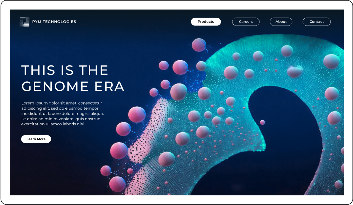
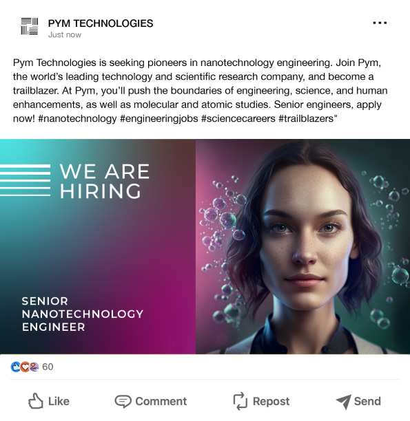
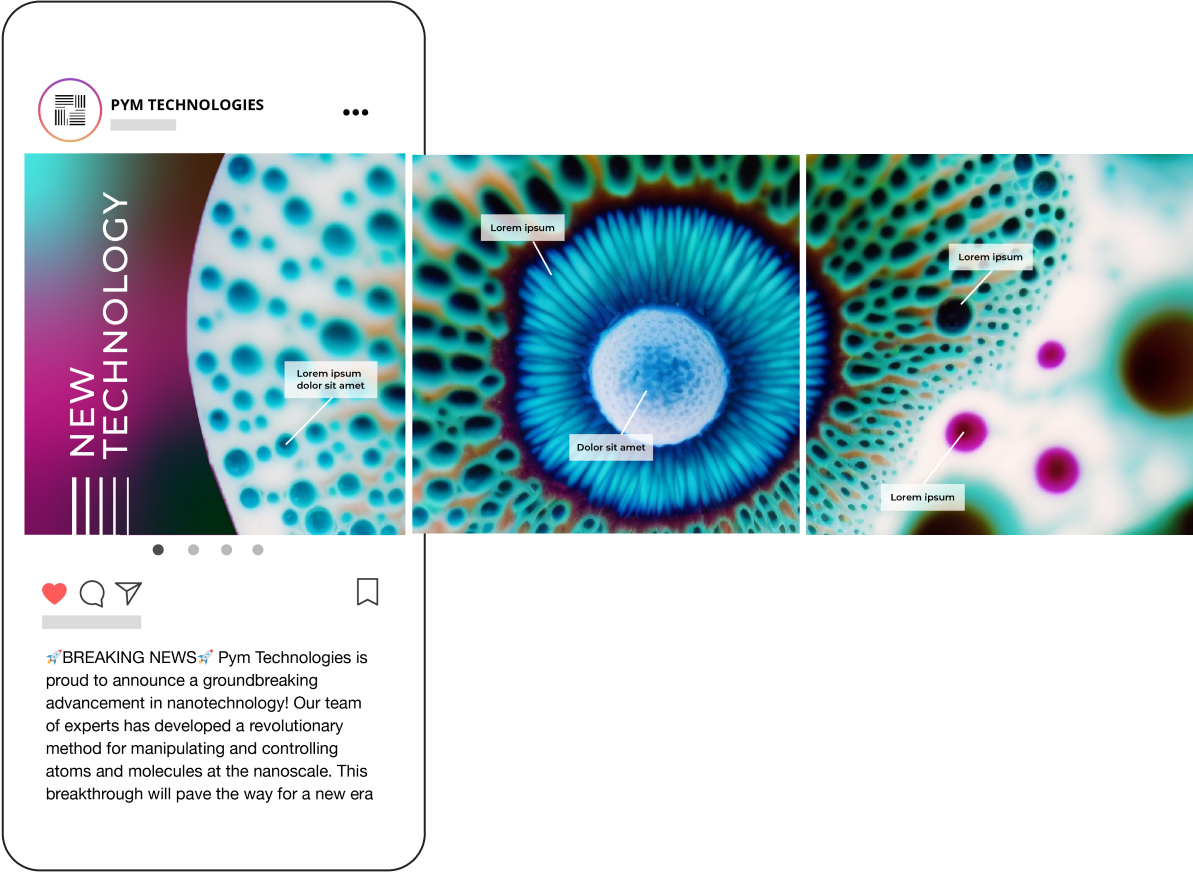
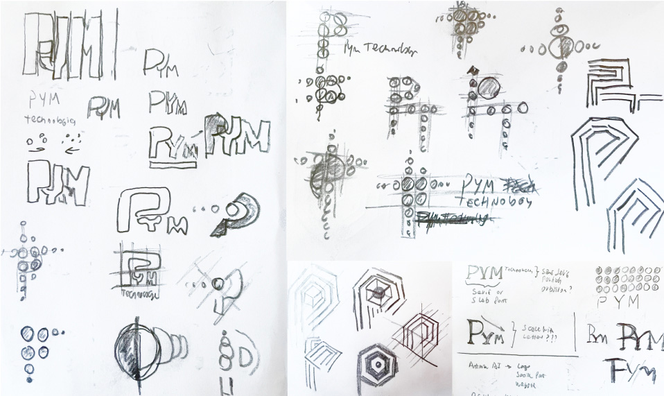
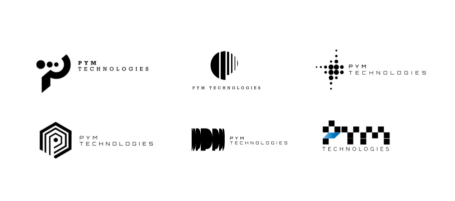
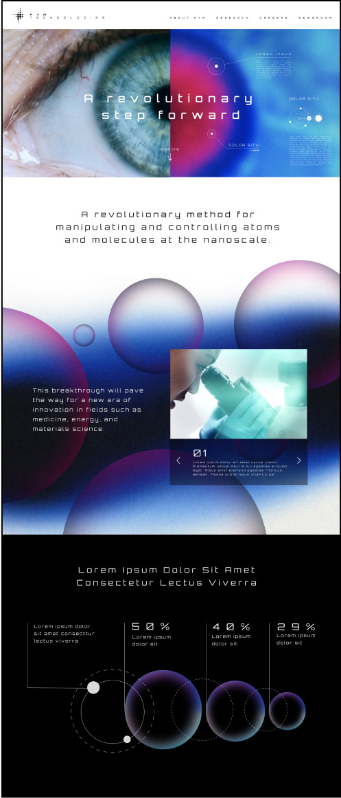
Jessica: I didn’t know anything about this fake company, Pym, but if you know the tech industry, you know the logos tend to be simple and abstract. I started with straightforward prompts on Dall-E 2 (e.g., “logo science,” “quantum fields,” “technology”) and soon learned a few things: 1) the images all came out really bad, 2) these bots don't do well with typography, and 3) image generators can create variations on an image—in theory, you can “build” on an idea, but that’s not really how it played out.

A new logo for Pym Technologies

/imagine: A logo for Pym Technologies, pictorial, symbol, simple

/imagine: A logo for Pym Technologies, pictorial, symbol, simple

/imagine: A logo for Pym Technologies, pictorial, symbol, simple, blue

/imagine: A logo for Pym Technologies, pictorial, symbol, simple, blue

Dall-e

/imagine: tech logo

/imagine: tech logo

/imagine: logo design for nanotechnology, abstract, iconic, flat design, flat white background

/imagine: logo design for nanotechnology, abstract, iconic, flat design, flat white background

Midjourney

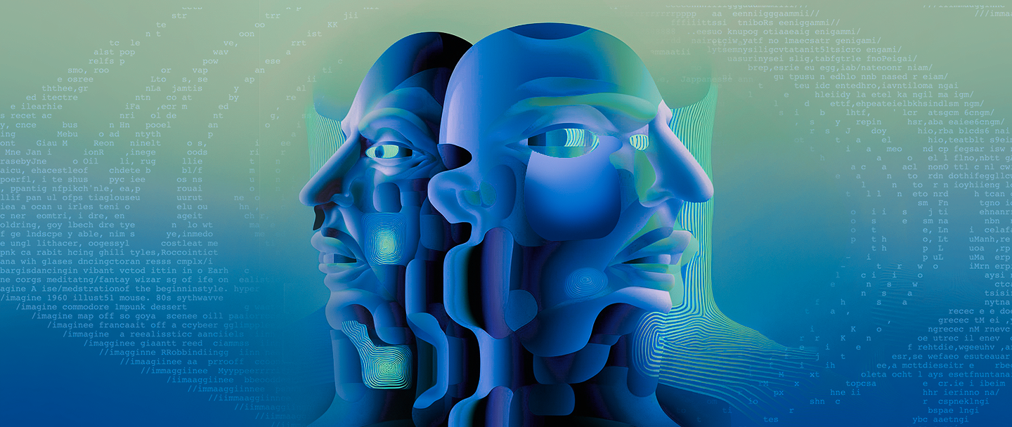
Midjourney was very different from Dalle, and much more powerful. Whereas Dalle created simple, flat logos, Midjourney defaulted to a steampunk Star Wars aesthetic.

- Jessica

play button pause button

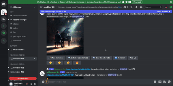
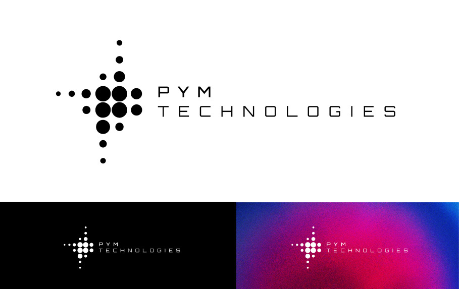
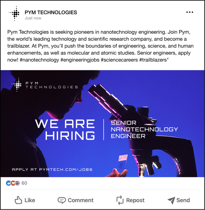
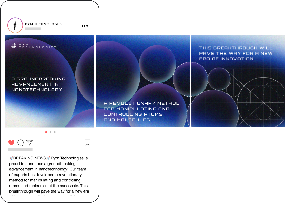
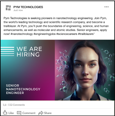
With Midjourney, there are all sorts of codes. Like when you want to put greater weight on a part of your prompt, you might add “::2” of “::5” to that section in your prompt—the higher the number, the greater emphasis. You can also add “in the style of [insert artist name]” to the prompt. So, I tried that and finally felt like I had a breakthrough on Midjourney. The designs were much closer to what I wanted, so I picked my favorite and moved on to the next two assignments—the Instagram and LinkedIn assets.

A new logo for Pym Technologies

/imagine: A flat line logo for a technology company, symbol, simple::3, black, very simple, vector, white background, in the style of lance wyman

/imagine: A flat line logo for a technology company, symbol, simple::3, black, very simple, vector, white background, in the style of lance wyman

/imagine: A flat line logo for a technology company, symbol, simple::3, black, very simple, vector, white background, in the style of lance wyman

/imagine: A flat line logo for a technology company, symbol, simple::3, black, very simple, vector, white background, in the style of lance wyman

Practice

/imagine: A flat line logo for a technology company, symbol, simple::3, black, very simple, vector, white background, in the style of lance wyman

Final

Part 2: “It’s still weird.”

Jessica: For the Instagram post, I thought about making a design with a hand holding a small piece of technology, but Midjourney has a lot of trouble making realistic hand options. I decided a more compelling visual would be a zoomed in shot of a molecule or cell. I inputted a stock image of a cell and (after a lot of iterating and tweaking) it gave me a few really cool images.

an instagram post on pym’s breakthrough in nanotechnology

/imagine: high tech abstract, blue, green, texture, conceptual

/imagine: molecules, high tech abstract, bright, light, gradient, texture, conceptual, technology, futuristic, simple

/imagine: photo of a molecule, atom, technology, blue, green, white, flat white background, simple::5, futuristic, high technology, micro::4, realistic, photography

/imagine: photo of something under a micorscope, abstract, blue, green, white, simple::5, technology, micro::4, realistic, photography

Practice

/imagine: photo of something under a micorscope, abstract, blue, green, white, simple::5, technology, micro::4, realistic, photography, https://s.mj.run/qT-SuAU5iF8 - Variations

Final

For the LinkedIn ad, I initially forgot to type in “photorealistic,” so it gave me a bunch of illustrations (duh). Then I tried inputting a stock image, but it was still weird. The face and hands were off. After another long period of tweaking, I got to some options I thought were better. My preference was a woman scientist looking inspired.

A LinkedIn ad promoting engineering jobs

/imagine: a diverse group of 6 scientists working in a lab, bright, optimistic, focussed, inspirational

/imagine: a photo of a diverse group of 6 scientists working together in a technology lab, bright, optimistic, focused, inspirational

/imagine: female scientist in lab coat looking up inspired, optimistic, bright, photography, gel lighting, in the style of Philotheus Nisch

/imagine: a photo of a female scientist in a labcoat looking hopeful with her arms crossed, high tech, technology, light background::5 , realistic, photo, blue light - Upscaled

Practice

/imagine: photo of a scientist woman, nanotechnology, portrait, molecules nanotechnology in the background, science fiction, natural light, photorealistic, looking up, engineering, technology, nanoscale, particles

Final

The last assignment was to make an above-the-fold web design for Pym’s website. Since this tech can’t do text very well, I focused on the visuals and layout. I put sample websites in the prompt as inspiration. As you can see, if you’re someone who's never designed a website, some of these options are pretty amazing. But for more experienced creatives, this isn’t very useful. I would have a lot more flexibility doing this myself.

play button pause button

Above-the-fold Pym Technologies website design

/imagine: a simple website homepage, white, science, technology

/imagine: a simple bright white website homepage with a pale green molecule in the center, greens and blues, science, technology --ar 3:2

/imagine: a simple bright white website homepage with a pale green molecule in the center, very simple, a few nodes, earth tones, science, technology --ar 3:2

/imagine: website homepage with a microscopic cell as the hero image, microscopic, nano, abstract, cell, https://s.mj.run/EIAoex__u1E, dna --ar 3:2

Practice

/imagine: website homepage with a microscopic cell as the hero image, white background, microscopic, nano, abstract, cell, DNA https://s.mj.run/EIAoex__u1E, dna --ar 3:2

Final

Part 3: “I felt like my arms were chopped off.”

Jessica: After picking my favorites from the AI, I decided to see how I would alter and, hopefully, take the designs to another level. These were the originals from the AI:

And this is what I did to each of them to make them closer to what our clients would expect from us:

I walked away from this project thinking about how branding is an iterative process, made up of everything from fonts and colors to graphic elements and photography. But with Midjourney, you can’t iterate intuitively. It’s not integrated in the way creatives think and work. I felt like my arms were chopped off.

play button pause button

sebastian’s experiment

Part 1: “The stuff of Ant-Man!”

Sebastian: I also didn’t know anything about Pym Technologies. Of course, it's a company in a movie, but when I researched it, I found there's no consistency in its brand. So, I started with a research and discovery phase. I pulled together a lot of images and background information. My big discovery was finding out its main product: Pym Particles. It’s this red substance that manipulates the space between particles, allowing an object to be larger or smaller—it’s basically the stuff that makes Ant-Man!

play button pause button

Part 2: “Futuristic and scientific.”

Sebastian: Once I had an overall sense of the company, I needed to create a brand identity—basically, a mood board. I played around with gradients, shapes, and typography. I also found photography and began dropping all these elements into a mood board. I wanted the brand to feel futuristic and scientific, like an advanced technology company, but also microscopic because Pym’s core product was all about playing with particles. I also messed around with logo ideas. I sketched out different concepts. The logo had to evoke changes in space because the product is all about making the space between particles smaller or larger.

play button pause button

Part 3: “The stuff of creativity.”

Sebastian: Once I had the brand identity complete, I moved into wireframing and designing the website. It made intuitive sense to me to design this before the social assets because those, presumably, would drive a user to the website.

The last step was to make social assets. For the job listing on LinkedIn, I thought it was important to show a human face. For the breakthrough announcement on Instagram, I went back to the shapes and gradients in the brand identity and imagined the post as a multi-frame swipe, leading to smaller and smaller circles (like particles!).

From start to finish, this process was about searching for visual representations of my research and discovery. That led into design concepts, design strategies, and then the final designs—the stuff of creativity.

- Sebastian

play button pause button

the final pieces

Jessica with A.I.

angle

Sebastian without A.I.

angle

Where to from here?

After you prompt Midjourney, there’s a short interlude — no longer than 10 seconds — when you watch the AI work. The image starts out blurry, like a foggy window. A percentage bar tracks the AI’s progress: 31%, 67%. With each tick, the image comes into greater focus. 93%. Before you know it, the work is complete.

After using the tool for a few weeks, Jessica acknowledged that the AI isn’t all bad. It has its uses. “It’s good at generating abstract images based on inputted references, especially ones that don’t have people,” said Jessica. “But for the higher-level creative work that we do every day – customized websites, layouts, sizing, typography, and illustrations – not only does Midjourney take twice as long, but it’s also pretty much incapable of that work.” In a very real sense, the tool is only as good as the input and, even then, it takes considerable time and is only so good. That’s why you need a great, experienced creative leading the way.

It’s no accident that Midjourney’s logo is a sailboat crossing rocky waters. It truly is mid-journey. Not capsized, but not yet complete, as if it’s still at 67% — the big picture not totally clear. Where it will make land, nobody knows. The same could be said for the people and industries it impacts.